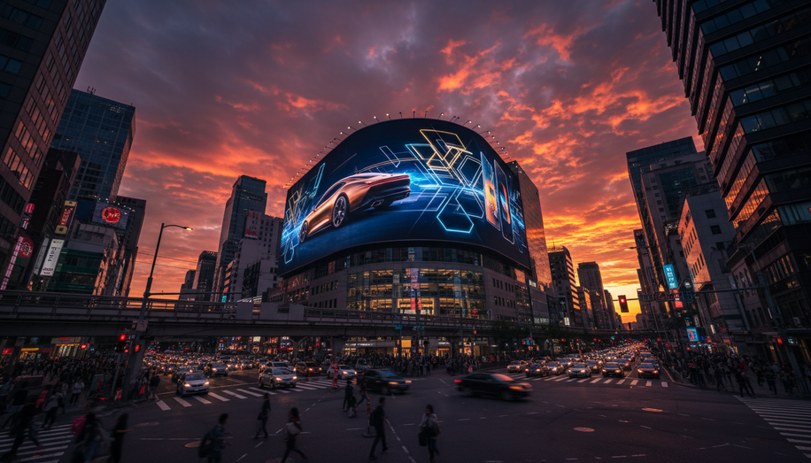
Outdoor advertising operates under an unforgiving constraint: you have roughly three seconds to capture attention and communicate your message. In a world saturated with visual stimuli, this means every design decision matters. The art of creating memorable OOH advertising lies not in complexity or elaborate details, but in the disciplined application of visual principles that make ads impossible to ignore from a distance.
The foundation of effective OOH design rests on simplicity. This doesn’t mean boring—it means purposeful. Designers must resist the temptation to fill every inch of space with text and imagery. Instead, the strongest campaigns embrace bold, high-contrast visuals paired with minimal copy, typically limited to five to eight words maximum. A single clear message, communicated instantly, ensures that whether viewers have three seconds or three-tenths of a second, they understand what you’re saying. This principle applies across all formats, from massive billboards to street-level posters.
Color selection deserves particular attention in outdoor environments. Research demonstrates that high-color contrast can improve advertising recall by 38%, according to design standards in the industry. Combinations like yellow and black or red and white don’t just look striking—they function as visual tools that guide the eye and ensure legibility from considerable distances. Bright, eye-catching colors prove especially valuable in environments already crowded with competing advertisements, where standing out becomes a matter of survival.
Typography represents another critical battleground. Sans-serif fonts like Arial, Helvetica, and Futura dominate effective OOH design because they remain legible from far away and at high speeds. The temptation to use decorative or serif fonts for sophistication must be resisted; elegance in outdoor advertising comes from clarity, not ornamentation. Text should be large enough to remain readable under varying lighting conditions, and letter spacing should receive careful attention to maintain professional polish.
Visual hierarchy and negative space transform good designs into great ones. Negative space—the empty area surrounding elements—isn’t wasted real estate; it’s a design tool that improves readability by giving text and images room to breathe. It guides viewers’ eyes toward the most important information and creates a sense of sophistication and modernity that cluttered designs simply cannot achieve. When designing outdoor ads, think in terms of shape and silhouette. The most iconic OOH visuals often work in outline alone, registering quickly even at high speeds or from significant distances.
Location considerations directly influence design strategy. A billboard readable from 500 feet demands different treatment than a storefront sign meant to be seen from across the street. Understanding the viewing distance, angle, and traffic patterns shapes every design choice. High-traffic areas warrant bold, immediately comprehensible visuals, while more subdued locations might accommodate slightly more experimental approaches—though the core principles of simplicity and clarity always apply.
High-resolution imagery and consistent branding form the technical backbone of professional OOH work. Blurry or low-quality visuals undermine credibility and reduce campaign effectiveness. Every graphic element must maintain the highest standards to project professionalism. Similarly, logos and taglines require clear, unobstructed placement so brand recall happens instantly.
The strongest outdoor advertising campaigns leverage emotion through strategic storytelling while maintaining design simplicity. A compelling narrative that triggers emotional responses creates memorability and encourages audience engagement. This doesn’t require elaborate visuals—often the opposite. A single powerful image combined with a provocative headline delivers more impact than complex compositions.
Creating memorable OOH advertising ultimately means understanding that restriction breeds creativity. The three-second constraint isn’t a limitation to resent; it’s a clarifying force that eliminates everything superfluous and reveals what truly matters: bold visuals, clear messaging, and flawless execution. Designers who master these fundamentals don’t just create advertisements; they create impossible-to-ignore markers in the urban landscape that build brands and drive results.
Ultimately, mastering the three-second constraint isn’t just about creative vision; it’s about informed execution. Blindspot directly addresses this challenge by providing **location intelligence and audience analytics**, enabling designers to optimize every visual choice for specific viewing environments and target demographics, ensuring instant comprehension and impact. By leveraging **real-time campaign performance tracking**, brands can continuously refine their OOH design strategies, transforming the urban landscape into effective, impossible-to-ignore brand touchpoints that drive measurable results. https://seeblindspot.com/

